When packaging, it’s not just about making it look pretty. It’s also about making it effective. In this blog, we’ll take a look at four packaging redesigns that boosted sales for different brands.
Lay’s

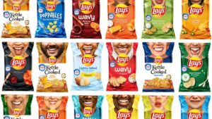
(Souce: Marketing Dive)
Lay’s potato chips, brought back its limited-run “Smiles” packaging with more than 70 new designs of its chip bags that showed the smiles of 30 people who were helping their communities. These “Everyday Smilers” included people who have helped others facing homelessness, hunger or limited access to healthcare services, among other causes.
Because the pandemic disrupted a planned photo shoot with the “Everyday Smilers,” Lay’s asked them to take selfies on their smartphones and submit them digitally. Lay’s used computer-generated imagery (CGI) technology to enhance the amateur selfies and transfer them to its packaging.
These helped maintain and even boost sales during a period when everyone was at home and the economy was seeing a downturn.
Cadbury

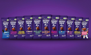
(Source: Packaging Strategies)
Secondly, we’ll look at the popular chocolate brand, Cadbury. Apart from tasty chocolate, Cadbury serves up a silky and minimalistic design to give the customer a smooth experience even before they’ve laid their hands on the chocolate. Their signature purple wrapping makes Cadbury chocolates one of the most recognisable brands out there but preserves the product well too.
Dunkin’ Donuts

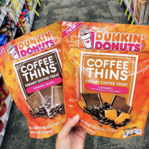
(Source: Beauty Packaging)
Next, Dunkin’ Donuts. They boosted sales through packaging but not the way you think. They made themselves known for more than doughnuts. They branched out to other foods, as you can see above with their coffee thins, and adopted flexible packaging. Diversifying your product portfolio is a great way to boost sales and for that, you need to come up with ideas for packaging. Dunkin’ Donuts is a great example for this.
Dettol

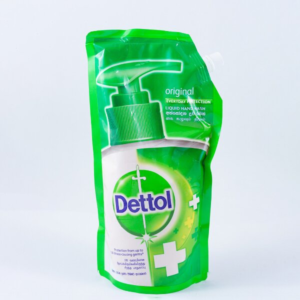
(Source: Dettol)
In fourth, we have a special kind of packaging One that supplements the main product. Dettol refill packs are a convenient and cost-effective way to keep your home clean and hygienic. These packs allow you to refill your existing Dettol spray bottles or dispensers, rather than having to purchase a new one each time you run out.
To put it simply, Dettol used environmental-friendliness in their favour by creating a product that embodies that and allows the customer to come back to the Dettol brand, resulting in a sales boost to its hand wash products.
Attractive, safe, and consumer-friendly packaging can:
Packaging redesigns can be a powerful marketing strategy for brands looking to stay relevant and boost sales.
However, redesigns can also fail if not executed correctly. For example, Tropicana’s redesign, which featured a more modern and cleaner design, removed elements that consumers were familiar with and ultimately failed to consider consumer recognition and product identification.
Overall, redesigns can be a valuable tool, but they must be approached with careful consideration and planning to ensure success.
You’re probably wondering where number 5 is. It’s for you!
We have reserved that spot for your brand. At Varna packaging, we are sure to make your brand a success story too! For future-focused, small and medium, environmentally responsible, and cost-conscious businesses; Varna is the like-minded flexible packaging partner that will serve as an agile innovator!